Saturday, 30 November 2013

Concentric Circles

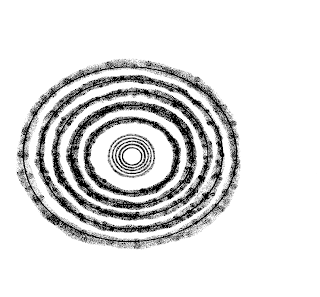
In the background of my front page I will be using images of circles that will appear to emit from the Anarchy symbol on "Spike's" top. This image was created by me using paint. To create these circles, I used the circle shape tool and looked at the axis to ensure that each circle was the same distance apart from the other. Once I had created each of the circles, I used the airbrush tool over each of them. This makes it similar to the drawn on Anarchy symbol on "Spike's" top, perhaps creating the graphic match effect of showing two items that are similar in shape and linking them together, the circle on the anarchy symbol and the concentric circles.


Concentric circles are circles that seem to be either emitted from the centre of the circles, or from the outer circle moving inward. There seems to be a direction to which way the circles are moving. My idea to use this came from a Kerrang! front page, where Kellin Quinn of Sleeping with Sirens, is holding a megaphone and appears to be shouting. The background of this page is lined with these concentric circles. This makes it appear as though he is shouting into the megaphone and the soundwaves are projecting outwards. This links well to the name of the band, the word 'sirens' has implications of loud noises.

There are a number of meanings to the concentric circles which I can use to explain my choice for them.

Firstly, punk rock is clearly a loud and hardcore genre of music that is not for the faint hearted. This is similar to the Kerrang front cover above, the implication of noise being projected outwards for everyone to hear.
Secondly, linking to the projection of noise going outwards, this could also be representative of how the punk movement began in the later 1970s in London and the US. It then spread out worldwide until thousands of youths and working class adults joined the movement. This could be shown by the concentric circles, showing the movement out from the anarchy symbol, breaking out across the page.
 
Thirdly, concentric circles are used in the RAF roundel (which I will be including in the contents page of my magazine). The mod's adopted this as their own symbol, it can be sometimes found on mopeds (a vehicle commonly associated with the mods). Mods would take existing symbols and artefacts and customise them to make them their own, this happened with the Union Flag and the RAF Roundel. Mods later on moved into groups such as the skinheads and then the famous subculture of punk.
 

Barcodes and Tartan

As my magazine would be on sale weekly in stores and supermarkets such as WH Smiths, Asda and Morrisons etc, I will need to include a barcode. This is conforms to the modern marketing styles that Punks would often try t stand out against so I will be adding a tartan print to layer underneath it. This adds to the bricolage and DIY style of the magazine which links well to the subculture of the target audience that I am aiming for.

I was able to design my own barcodes, and created a few different ones.


 I also created my own tartan print using three colours. I chose red, black and white because these are typical punk colours. The high contrasts of black, white and red is important to punks as it made them stand out. I looked on the website Color Wheel Pro and researched each of the three colours. Here is a link to the website:
and this is what I found-
 

Red Color  Red

Red is the color of fire and blood, so it is associated with energy, war, danger, strength, power, determination as well as passion, desire, and love.
Red is a very emotionally intense color. It enhances human metabolism, increases respiration rate, and raises blood pressure. It has very high visibility, which is why stop signs, stoplights, and fire equipment are usually painted red. In heraldry, red is used to indicate courage. It is a color found in many national flags.
Red brings text and images to the foreground. Use it as an accent color to stimulate people to make quick decisions; it is a perfect color for 'Buy Now' or 'Click Here' buttons on Internet banners and websites. In advertising, red is often used to evoke erotic feelings (red lips, red nails, red-light districts, 'Lady in Red', etc). Red is widely used to indicate danger (high voltage signs, traffic lights). This color is also commonly associated with energy, so you can use it when promoting energy drinks, games, cars, items related to sports and high physical activity.

White Color  White

White is associated with light, goodness, innocence, purity, and virginity. It is considered to be the color of perfection.
White means safety, purity, and cleanliness. As opposed to black, white usually has a positive connotation. White can represent a successful beginning. In heraldry, white depicts faith and purity.
In advertising, white is associated with coolness and cleanliness because it's the color of snow. You can use white to suggest simplicity in high-tech products. White is an appropriate color for charitable organizations; angels are usually imagined wearing white clothes. White is associated with hospitals, doctors, and sterility, so you can use white to suggest safety when promoting medical products. White is often associated with low weight, low-fat food, and dairy products.


Black Color  Black

Black is associated with power, elegance, formality, death, evil, and mystery.
Black is a mysterious color associated with fear and the unknown (black holes). It usually has a negative connotation (blacklist, black humor, 'black death'). Black denotes strength and authority; it is considered to be a very formal, elegant, and prestigious color (black tie, black Mercedes). In heraldry, black is the symbol of grief.
Black gives the feeling of perspective and depth, but a black background diminishes readability. A black suit or dress can make you look thinner. When designing for a gallery of art or photography, you can use a black or gray background to make the other colors stand out. Black contrasts well with bright colors. Combined with red or orange – other very powerful colors – black gives a very aggressive color scheme.


Picture Blogging - Here is a blog of the photos and the edits that I have made - still to be updated


Picture/Edited Picture
Date Taken/ Edited
Picture Name
Place In Magazine


24/10/2013
Spike
Front Cover


  31/10/2013
Buffy
Contents Page


 28/11/2013
Edited Spike
Front Cover


 4/11/2013
Edited Buffy
Contents Page
 
 
 10/12/2013
Me
Contents Page
 
 
 10/12/13
Edited Me
Contents Page


 1/12/2013
Band
Double Page Spread
Still to be done


1/12/2013
Band Edited
Double Page Spread 


Thursday, 28 November 2013

Editing the Magazine Front Page First Draft Video (Very long)

This is a link to an unshortened clip of me editing the first draft of the front cover of my coursework magazine. I will upload a shortened version soon using only the main important parts of the editing.

http://youtu.be/LvDH4xc5ggM

Sunday, 24 November 2013

What is Punk

Iggy Pop, is sometimes considered as the original punk. He was a member of the Stooges and famous for composing a mixture of pop, hard rock, jazz and blues. He was strongly influential on the punk subculture which began to emerge in the UK and USA during the mid 1970s.

Punk was described by Jon Savage as the punk movement as a bricolage of almost every previous youth culture in the Western World since the Second World War. It is influenced by the music, fashion, philosophical, political and artistic movements that were unusual to how the normal society would use these influences.

Punk was, and still is, about expressing anger against the government. This was mainly done by working classes, as they were sometimes unhappy with their political positions. Those in upper classes were not affected as much and so did not understand the feelings that were felt by the lower classes. This was because they had the money and education and ability to press their opinions in the more politically acceptable way. Working classes struggled to break out of their position and this led to their wanting to rebel. In all of history, there is never a government or a leading establishment that has pleased everyone's needs, this is simply impossible. As a result, groups will stand up and act out against their government, either by protest, war or more recently, by creating subcultures that are against higher authorities.

A modern day example of this is chavs, they are a common subculture in England, often associated with crimes and anti social behaviour and living less financially stable lives. They, as other subcultures do and have done, use symbolism in the way that they dress, the food they eat, the music they listen to etc. For example, chavs adopted the tracksuit, Burberry prints and gold jewellery ("bling"). This is done in other subcultures, the goth is known for wearing black, the hippy for having long hair etc.

Punk was an aggressive movement, controversial to the hippy movement. The hippy's focused more on world peace, where as punks wanted a fight, they wanted to attack and scare people. This is implied by their spiked hair, their rough clothes, safety pins (the DIY, bricolage feature of punk), the anarchy symbol, the fishnet stockings and other clothing and symbols. What they wore acted as a middle finger stuck up at the government, the symbolism was aggressive and threatening.

The Sex Pistols "God Save the Queen", rips up the British higher classes, it uses the name of the British national anthem to verbally protest against upper British society. This is just one of many examples of the punk rock bands shouting against England.

I have researched a lot into punk rock and other similar subcultures to help me with making my magazine for coursework. It will help me to evaluate and explain my choices of certain Punk features, also allowing me to state where they originated from.

Buffy Picture Analysis

In my magazine, I will include an image of a band member from my made up band "The Uncommoners", "Buffy". This will be used to open up the target audience to women as well as men, as a girl icon will be more likely to draw in female attention. The image of her here demonstrates a few of the symbols that are commonly associated with a punk rocker.

Firstly, her tartan dress. During the mid 1700s, it was ban to wear tartan by the British government that applied to all men in Scotland. If this law was broken six years of imprisonment was given, if a second infringement occurred, 7 years over seas was the punishment. This was done so that the Scottish would adopt Lowland cultures. The punks took this idea into account and adopted the tartan print as a symbolic act of rebellion against the British government.

Secondly, the Dr. Marten boots which link more to the skinhead side of punk rockers, a movement during the 1960s. Skinheads tended to be from working class, the dressed in ways that suited their lifestyles and their jobs. Dr. Martens were worn. Sometimes, the skinheads would wear laces in their boots that were representative of their football teams or their political thoughts.

Thirdly, the Union Flag mat. The use of the Union Flag by punks was in irony, as they disliked the establishment. By wearing and claiming the flag as a symbol of the subculture, they were symbolically acting against the government, perhaps even mocking it.

The edits to this picture are a copy of the cheap photocopy style of fanzines that were popular during the punk movement. Fanzines used inexpensive copying methods so that their zine was available to larger audiences who could afford the low price. This was part of Dick Hebdige's bricolage idea, that the subculture of punks would create their own identity using symbols and gestures that would be recognizable as their own. The poor quality images in fanzines was symbolic of being their own as they would not follow societal norms of investing in good quality paper. They used DIY as a weapon against the government, avoiding conformation to big brands or companies.

I will use this image of "Buffy" to advertise a prize in the contents page. In one of the corners I will include the word "WIN", using the centre dot of the typical mod RAF roundel to be the dot on the top of the 'i'.

Interviews Summary

I have done four interviews, alongside the 5 questionnaires that I handed out, in order to get some information about people's expectations of a magazine and what they like to find in a magazine. The first two interviews I did were more formal, it was more of a structured interview, where as the second two interviews were unstructured interviews. All of the questions I asked were open questions with the opportunity for the interviewee to respond with any possible answer that they wanted.

From the first two interviews, I found that freebies, posters, articles, pictures and a good layout are what would be expected in a good magazine. Most people buy magazines to read into and keep up to date with the topics that they like, find out about bands or fashions. £2 was thought of as a good price for a weekly magazine.

From the second two interviews, I found that the main feature for a good magazine was good contents, and avoiding agony aunt letters. The cover was said to play an important part in whether or not someone buys a magazine as it is the first part of the magazine seen by one of the interviewees, where as the content was said to be the main factor in whether a magazine is bought or not for the other interviewee. £1.50 was the general price that was thought of as reasonable for a weekly magazine, for a monthly magazine, £3 or £4 to £5 was suggested.

From the information that I have recorded, I will use the thoughts of the interviewees to create a magazine that demonstrates some of the features that were mentioned.

Thursday, 21 November 2013

Bricolage research

http://www.slideshare.net/lilyvalentine/bricolage-power-point
I have done a bit of research on the bricolage element of the punk rock subculture

Skinheads Research

http://www.slideshare.net/lilyvalentine/skinheads-28483841
As my punk rock magazine will be targeted at subcultures, I have researched the skinhead subculture and taken some notes in this power point.

Tuesday, 19 November 2013

Magazine Questionnaire Results Analysis


Magazine Questionnaire Results Analysis

I gave out the magazine questionnaire to a random group of people. I used a range of open and closed questions to gather my results so that they had the opportunity to add their own answers if the answers given were not what they would choose. At the end of my questionnaire I wrote a debrief to allow them withdraw their results if they didn't wish for me to keep hold of them. Here are my results from the study.

5/5 of the people I gave the questionnaire to have in the past or currently do read magazines.

Only 1/5 of the people I gave the questionnaires to no longer reads magazines due to them being too expensive.

Here is a tally of each of the types of magazine that people enjoy reading.

Gossip
Fashion
Music
Sport
Film
Design
||
|||
|||
||
|
|


Fashion and music, as can be seen in the results above, were two most popular, with film and design being the least popular.

4/5 of the people I gave the questionnaire continue to read their chosen magazines.

Only 1/5 of the people I gave the questionnaires to no longer reads magazines due to them being too expensive. I will bear this in mind when deciding how to price my own magazine.

Kerrang was the most popular magazines mentioned by 2/5 of the participants. The general popular choice for magazines was music, including NME, Sight & Sound, MOJO and Kerrang. However, Gossip the evidence I found suggests that gossip magazines are very popular to, as shown on the table below.

Gossip
Fashion
Music
Sport
Film
Design
Closer
Glamour
Take a Break
Pick Me Up
Closer
Glamour
GQ
MOJO
Kerrang
Sight & Sound
NME
Ride UK
Four Four Two
GQ
Empire
Little White Lies


Here is a tally of the different reasons why people are more likely to buy a magazine.

Offers
Not too expensive
Interest in what the issue is about
Eye catching front cover
Interest in that magazine
||
|||
|||
||||
||


These results show that one of the main reasons that people will buy a magazine is because of an eye catching front cover, 4/5 of participants selected this as a factor that encourages them to purchase a magazine. Two other important factors are that there is an interest in what the issue is about, this could link to the eye catching front cover as people will notice the name of bands, brands or celebrities that are interested in, on a front cover. The two least chosen were the offers available (including posters, gifts, freebies, vouchers etc.) and a general interest in the actual magazine.

I will use this information that I have gathered, along with the information from my interviews, to help make my punk rock magazine appealing to its target audiences, focusing on the importance of the front cover to the buyer.

Representation of Ethnicity in the Media

http://www.slideshare.net/lilyvalentine/ethnicity-28406584

Sunday, 17 November 2013

Double Page Spread Analysis NME - Coursework


Double Page Spread Analysis - NME


Mac DeMarco

A key feature in this double page spread is the use of lighting; the dull but blinding lights are part of the unforgettable experience at a live gig. This image manages to capture the lighting in its frame, displaying a range of colours, green, and red, yellow. This has the effect of recreating the exciting and manic atmosphere at a gig. Outside of the image, the colour scheme uses white, black and blue. A lot of the writing is highlighted with a different coloured background, for example the title, Mac DeMarco, is written in white highlighted by an electric blue background. The image takes up most of the screen and the writing is mainly below the bottom half of the page. This makes the band the main focus, the two men at the front of the page in particular. Their positioning, the two men at the front with the other not on the same height level as them and further in the background, automatically draws the eyes to the front men. This is also done by their actions, they appear to be kissing each other, this creates a shock factor as it is quite rare to see two men kissing publicly, in particular when they are already at the centre of attention (because people have bought tickets to see them). This has the effect of making people want to read on and find out what’s going on.


Lou Reed

This double page spread uses a range of techniques that ensure Lou Reed, an influential American song writer and member of the Velvet Underground.  This double page spread is created Lou Reed’s memory after he died in Novemeber. The writing on the left of the page is similar to the London Underground font, which reflects a key area within the punk era. The uneven spacing between the words demonstrates the bricolage style adopted by punks to go with their DIY attitude. This is also shown in the top right hand corner of the page, where the word ego, framed in a salmon pink box, overlaps slightly onto the white text box, giving it the appearance of simply being stuck on top. The three colour theme is also a very typical punk feature, although this one adopts a kind of salmon pink instead of blood red alongside black and white. The black and white is suitable in the context of the page as it is in memory of him, the black and white used to show that this is looking back at his life. The photo is also not in a very high resolution, demonstrating the grungey punk style of images.

The Week
This page also plays with the use of lighing to draw the reader’s eyes across the page. The main focus is on the guitarist who is in the centre of the right hand page, he is in a beam of light on a stage surrounded by a crowd. The light is blue and a light on the bottom left hand side of the page has made the audience appear an orangey pink. There isn’t much writing on this page as the image is the key feature, however the placing of the title, the heading and the text box means that it is closely pact together and allows room for the image to take up the double page. I like this idea of the entire double page being an image and then only a small amount of text being used. I would like to copy this layout style for my own double page, as the main focus is on the image rather than the writing which is more effective as sometimes images are more easy to interpret for readers than what